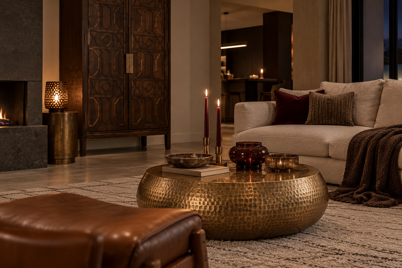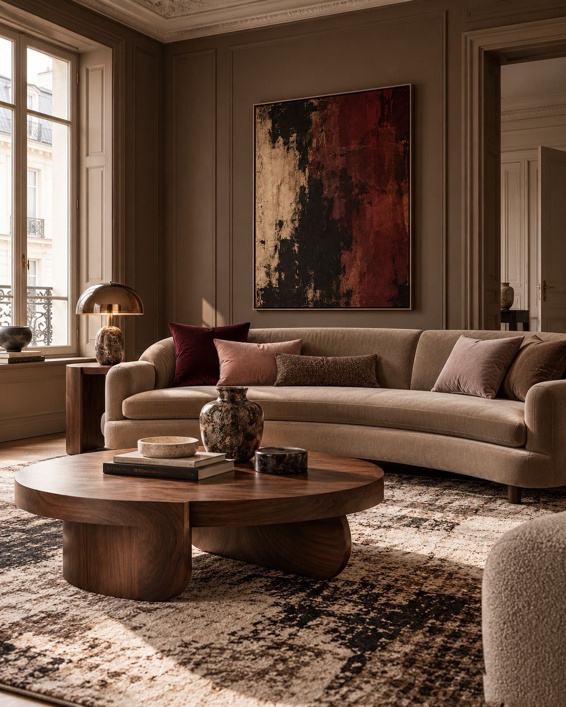
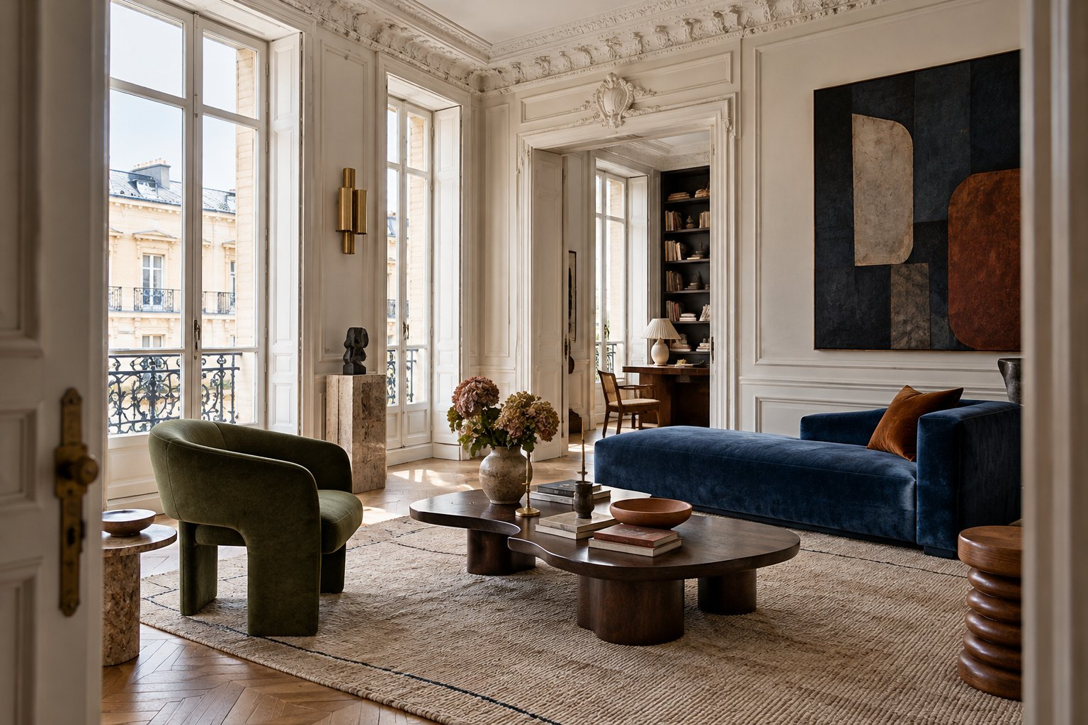
HOMEOCTOS inspiration, with a selection of pieces to recreate the atmosphere.
Interior design is entering a more expressive chapter. After years of restrained palettes and carefully coordinated rooms, a different approach is gaining momentum, one that welcomes the contrast between old and new, celebrates the character of materials and gives greater importance to the way a home feels.
The change is visible across international design fairs, material collections and emerging colour directions. Craftsmanship is finding new relevance in contemporary settings, darker woods are being reconsidered, and furniture is increasingly valued for its ability to bring both comfort and individuality into everyday spaces.
Yet the most interesting direction for 2027 may not be a particular colour or material. It is the growing freedom to combine different influences without sacrificing coherence.
An antique-inspired cabinet can sit comfortably beside a modern sofa. Sculptural lighting can transform an understated dining room. A richly coloured chair can give an otherwise neutral interior its defining personality.
In this special editorial, HOMEOCTOS explores eight directions shaping the year ahead, examining the materials, design ideas and practical choices behind each one.
Because a memorable interior is not defined by how closely it follows a trend, but by how thoughtfully it reflects the people who live there.
01. The New Colour Language
Colour as atmosphere, not an afterthought
For 2027, our colour edit moves beyond the idea of a single fashionable shade. What interests us is the relationship between saturated colour and the materials that surround it. Burgundy, forest green, cocoa brown and deep blue can create architectural depth; ivory, pale stone and soft taupe give the eye somewhere to rest. Used together, they produce more nuanced interiors than a room built around one colour alone.
A deep-coloured wall changes the way every other element is perceived. Walnut appears warmer against burgundy. A pale upholstered chair becomes more sculptural against dark green. Brushed metal catches the light more clearly when it has a quiet background. The effect is not necessarily dramatic. When the contrasts are carefully controlled, even an intense palette can feel calm.
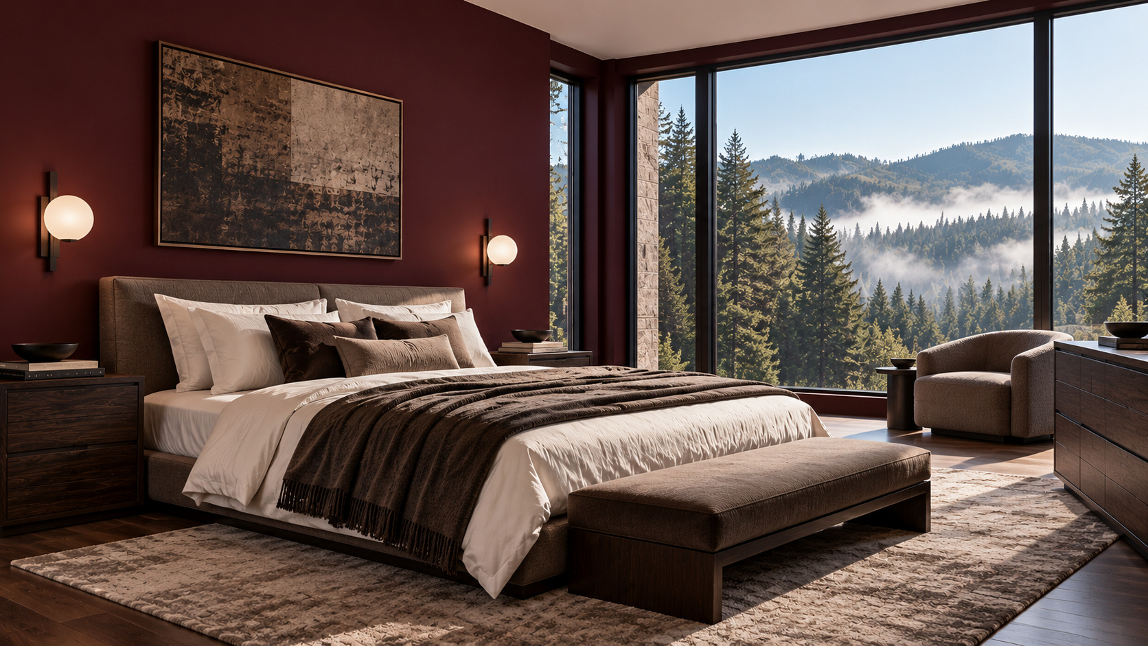 Style suggestion: Norlen walnut veneer bed base · 180 × 200 cm mattressStyle suggestion: Sarula burgundy cotton jacquard bedspread for a 150/160 cm bed
Select a glowing point to explore a compatible piece.
Consider the bedroom in our visual edit. The burgundy setting establishes a sense of enclosure, but the composition remains open because the bedding is lighter, the wood is visibly grained and the window introduces natural daylight. Each of these elements has a purpose. Without the lighter textiles, the room might feel visually dense. Without the dark furniture, the colour could seem disconnected from the rest of the interior.
The same logic can be applied to a smaller room. A continuous wall colour often creates a more coherent impression than several unrelated accent walls. Curtains in a close tonal family soften the transition from wall to window, while a single lighter chair or bedside lamp adds relief. The key is to decide where contrast is needed and where it is better to allow colours to merge.
Select a glowing point to explore a compatible piece.
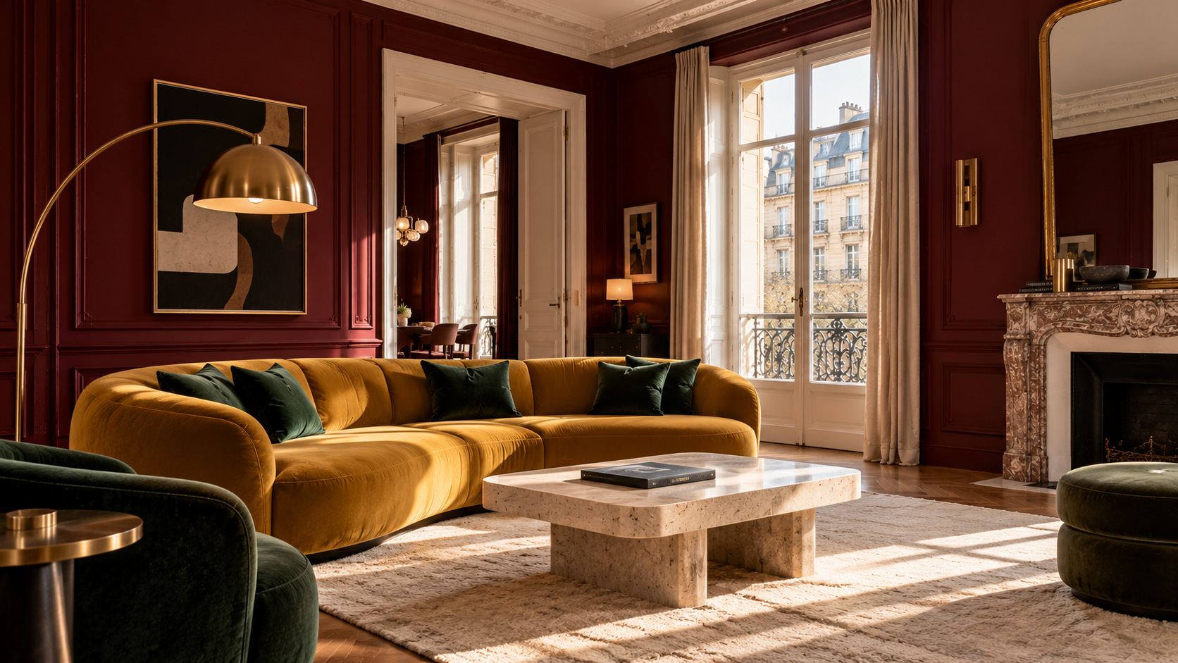
A mustard sofa against a burgundy backdrop offers a more expressive interpretation. Here, colour is not merely a setting for the furniture, it is part of the furniture's identity. The composition works best when the silhouette of the sofa remains clear and competing accessories are kept to a minimum. Strong colours do not require an equally strong pattern in every corner.
For HOMEOCTOS, the lasting idea is to treat colour as a way of shaping a room. Choose one principal hue, a supporting neutral and a smaller accent. Consider how each will appear in natural and artificial light, then let the materials provide the next layer of interest.
The styling edit: Begin with the largest surface or piece of furniture. Build the palette around it before choosing cushions, rugs or decorative objects. A confident room needs a clear hierarchy, not a long list of colours.
02. Heritage Meets Contemporary
The freedom to place different eras in conversation
A home does not have to belong to one design period. One of the directions we are exploring for 2027 is the deliberate combination of pieces with different histories and silhouettes. An old-world architectural setting can feel surprisingly current when paired with simple contemporary furniture, while a modern interior can gain warmth from one substantial, crafted piece.
The distinction is between contrast and competition. When every object is ornamental, the room has no visual centre. When one object carries the detail and the surrounding pieces are quieter, its character becomes more apparent. That balance is what gives a collected interior its confidence.
 Style suggestion: Sideboard · BrownStyle suggestion: Breon bordeaux hand-painted abstract artwork · 110 × 190 cm
Select a glowing point to explore a compatible piece.
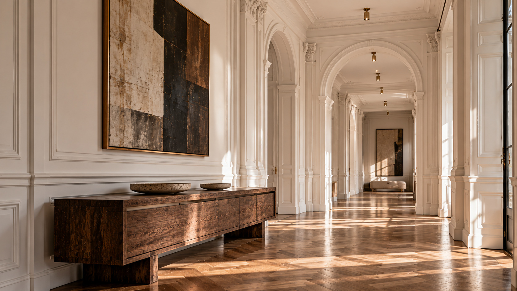
In the neoclassical hallway, arches and mouldings establish a clear architectural rhythm. A long, dark wooden console provides a strong horizontal line beneath them. The contrast comes from proportion and material rather than a clash of styles. A restrained arrangement on the console leaves the architecture visible and allows the wood to read as a deliberate choice.
Scale matters as much as period. A carved cabinet can become a focal point, but it needs enough surrounding space to reveal its form. If the room is compact, a narrower console, a single antique-inspired side chair or a framed work with a traditional profile can establish the same dialogue without overwhelming the floor plan.
Select a glowing point to explore a compatible piece.
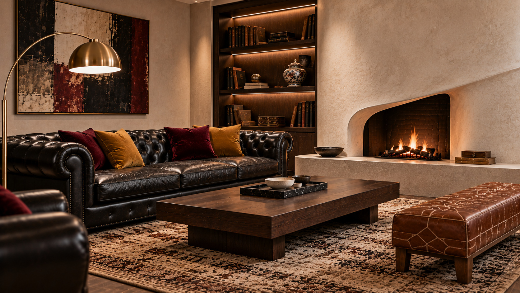
The Chesterfield composition explores another side of heritage. Leather, deep buttoning and a fireplace bring a familiar sense of permanence. Simpler supporting furniture changes the reading of the space. Clean lines, a less decorative table and carefully placed light prevent it from becoming a reconstruction of a historical sitting room.
Texture helps bridge the eras. Smooth leather sits naturally beside matte timber, woven upholstery or a low rug. Repeated materials can unify furniture that would otherwise appear unrelated. This is a more convincing approach than trying to match every wood tone, metal finish and decorative detail.
The styling edit: Let one expressive piece lead, then support it with contemporary shapes and enough breathing room. A home with character can acknowledge the past without living in it.
03. Materials with Presence
Depth is found in the surface
Materials are often reduced to broad categories: wood, metal, ceramic, glass, textile. Yet the experience of a room depends on their finer qualities. Walnut with pronounced grain has a different presence from smooth lacquer. A handmade-looking glazed tile reflects light unevenly, while a matte surface absorbs it. A woven chair changes the atmosphere even when its colour is nearly identical to the walls.
Our material direction for 2027 is therefore not a catalogue of desirable finishes. It is an invitation to examine what each surface brings to a space. Depth can be created with a small number of materials when those materials behave differently under light and feel distinct to the touch.
 Style suggestion: Kenta wall-hung bathroom cabinet · Natural teak · 90 cmStyle suggestion: Freestanding bath STANO Findlay Anti-Slide · Gloss white
Select a glowing point to explore a compatible piece.
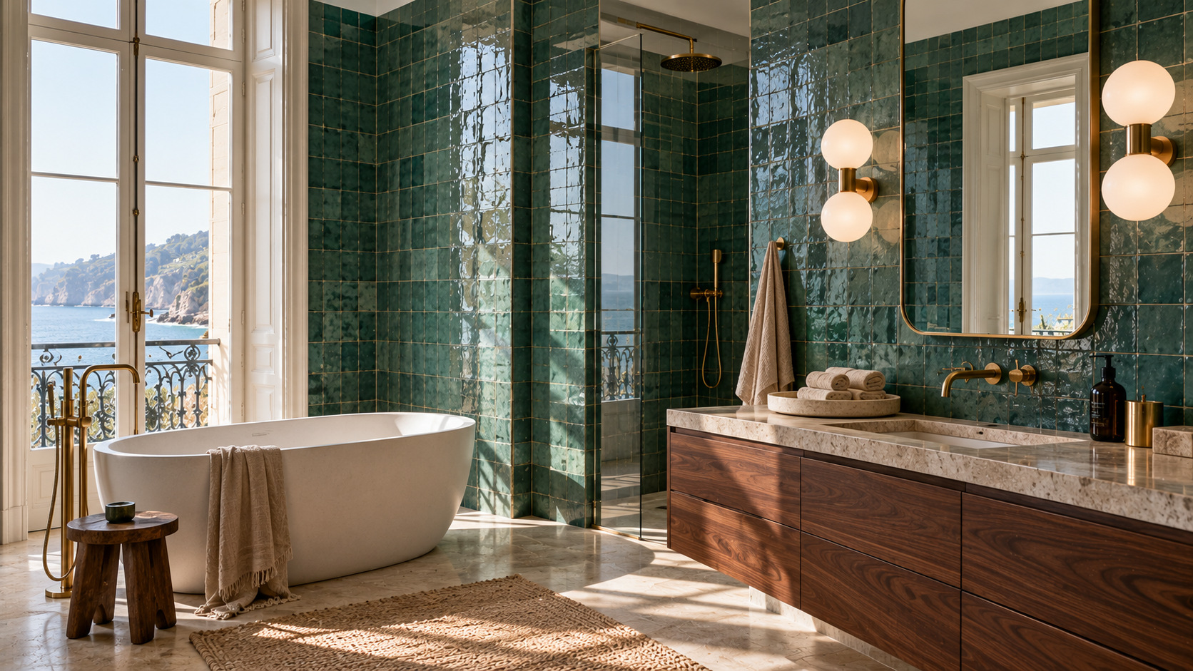
The ocean-green bathroom is built around that principle. Glossy green tiles create small, changing reflections across the walls. Walnut introduces a darker, quieter horizontal element. White sanitary forms provide visual relief, and the metallic details are deliberately restrained. The room feels detailed without relying on decorative clutter.
This is a useful lesson for living areas as well. Put a deeply grained table next to plain upholstery, or a reflective object on a matte sideboard, and the materials begin to define one another. Their contrast is easier to appreciate when each has space. Five highly textured objects on one shelf can have less impact than one beautiful piece placed against a simple wall.
It is equally important to consider use. A material that looks excellent in an editorial image must still suit the routines of the home. Upholstery needs to be comfortable and maintainable, a rug should work with circulation, and a table finish should fit the way the table is used. The richest interiors combine sensory pleasure with practical choices.
The styling edit: Choose one visible wood grain, one soft textile and one subtly reflective surface. Allow each to contribute a different quality rather than repeating the same texture everywhere.
04. Lighting as a Design Statement
One object can alter the entire composition
Lighting is capable of doing two jobs at once. It makes a room usable, and it can establish a strong visual identity. A sculptural pendant above a dining table acts as a focal object even when switched off. In the evening, its light changes the relationship between furniture, walls and people gathered around the table.
For this direction, we are interested in distinctive silhouettes rather than unnecessary complication. A generous pendant needs enough room around it. In a narrow space, smaller directional fittings may create a better result. The shape should respond to the ceiling height, the furniture beneath and the view through the room.
 Style suggestion: Round dining table · Dark walnut effect · Ø 120 cmStyle suggestion: Lisora beige papier-mâché ceiling lamp, Ø 35 cm
Select a glowing point to explore a compatible piece.
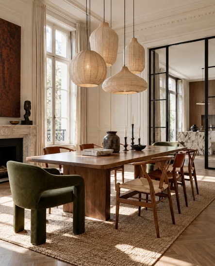
In our dining-room study, the suspended lights establish a rhythm above the table. Their forms introduce interest without relying on oversized ornament. The space beneath them remains clear and functional. Light is part of the architecture of the scene, not an accessory placed at the end.
A similar approach works elsewhere. A reading lamp should illuminate a seat without creating glare. A small table lamp can draw attention to the texture of a wooden cabinet. Discreet ceiling spots may reveal a corridor's proportions more effectively than a large decorative fitting. The right choice depends on how the room is experienced from different positions.
There is no need to make every fitting a statement. In fact, a striking pendant becomes more effective when other sources of light are visually quieter. The strongest rooms combine useful task lighting, a comfortable ambient layer and one clear focal point.
The styling edit: Decide what the light must do before choosing its shape. Then consider the fixture as part of the furniture composition, paying particular attention to proportion, placement and glare.
05. Eclectic by Design
Unexpected combinations, carefully composed
Eclectic interiors are sometimes mistaken for rooms in which anything can be placed beside anything else. We see the most compelling version differently. A strong accent becomes memorable because the rest of the composition gives it structure. One unexpected colour, one unusual shape or one deliberate pattern can change the entire personality of a space.
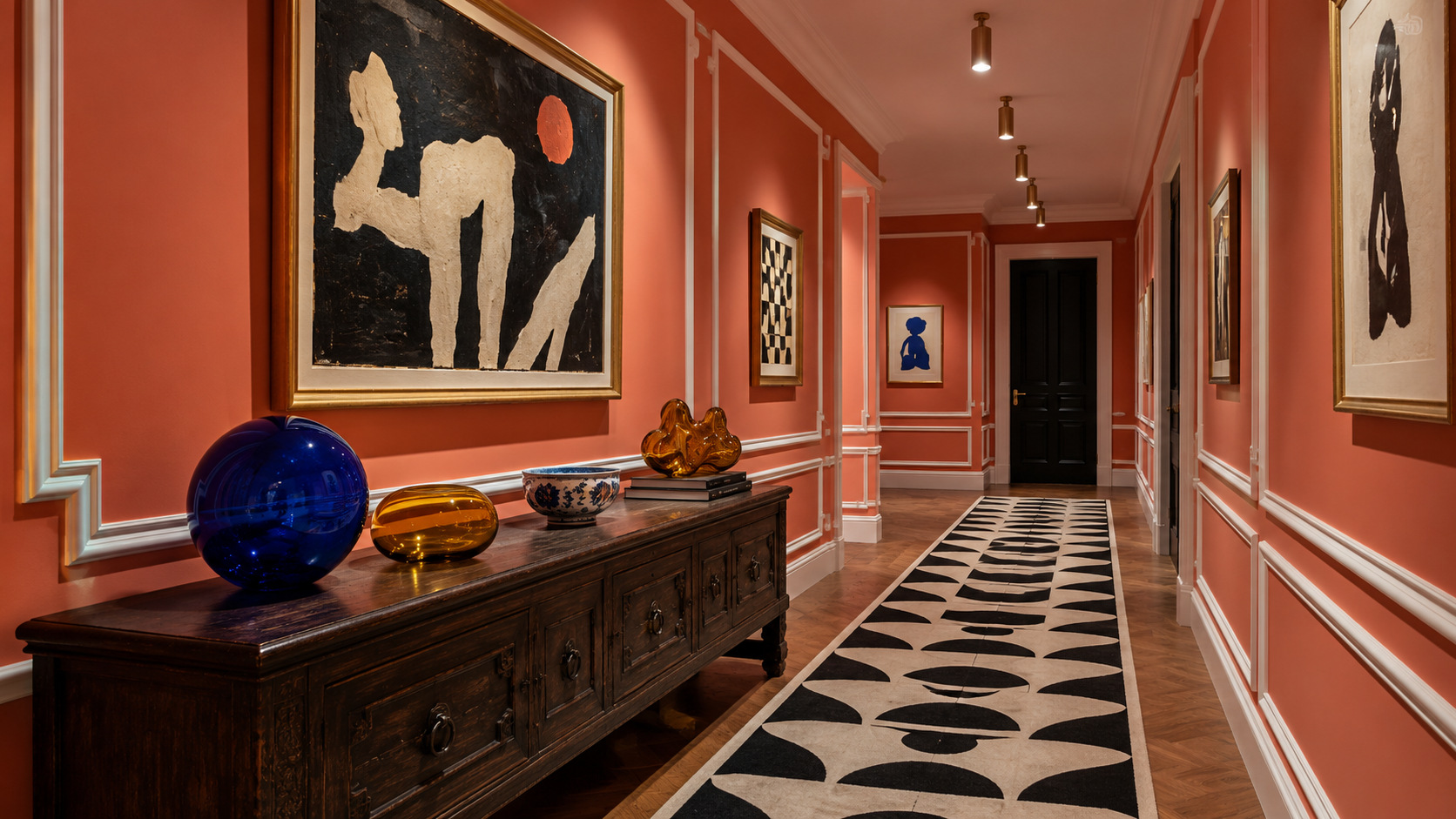
For 2027, the HOMEOCTOS edit embraces playful contrast without abandoning restraint. Cobalt blue can sit against coral. A geometric chair can contrast with a traditional bench. Sculptural glass can introduce movement to a room built from simple architectural lines. These combinations are expressive, but they are not random.
 Style suggestion: Nemore 3-drawer oak-veneer chest with ceramic top · 120 × 45 cmStyle suggestion: Sidula light amber glass vase · 37 cm
Select a glowing point to explore a compatible piece.
The coral hallway demonstrates how an overlooked transitional space can become a visual experience. Strong wall colour provides a continuous background. The blue glass object becomes an immediate point of focus, while a graphic rug adds movement along the floor. These three gestures are enough. The room does not need competing decorative features on every wall.
A useful way to work with eclectic pieces is to repeat a visual cue discreetly. A colour may appear first in a chair and again in a small object. A rounded light fitting may echo the curve of a table. Repetition gives apparently unrelated pieces a shared language without making them look like a matching collection.
 Style suggestion: Sorein white marble coffee table · 100 × 50 cmStyle suggestion: Ovelin velvet cushion cover · Burgundy and ecru · 45 × 45 cm
Select a glowing point to explore a compatible piece.
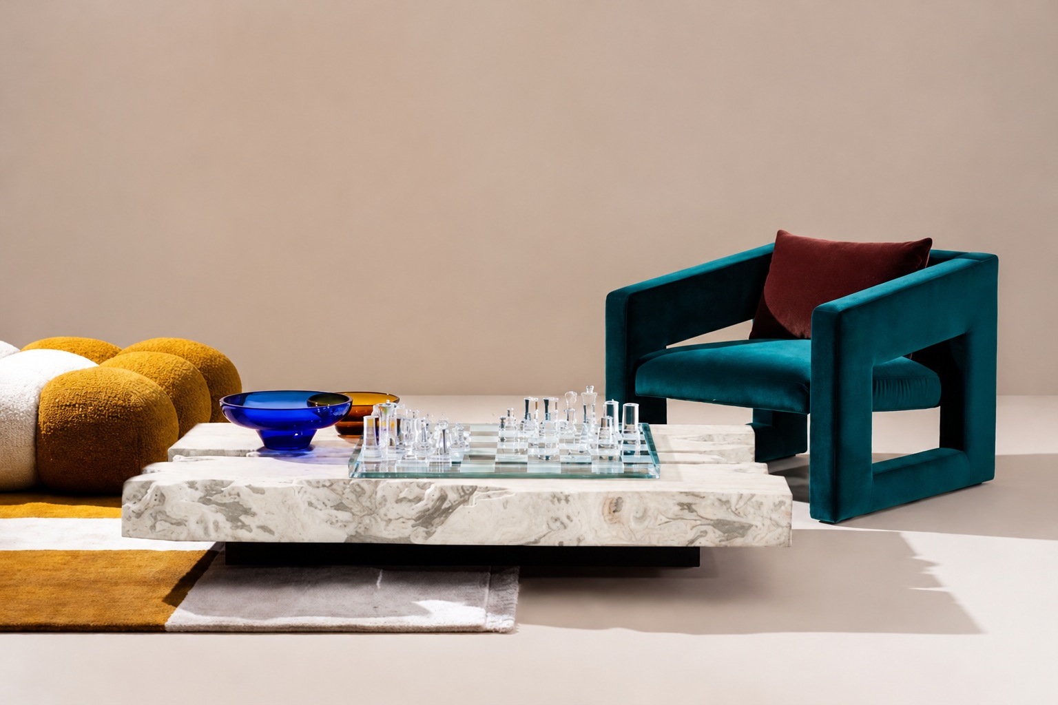
In the games corner, the relationship between the low table and the deep teal chair is more important than either object on its own. The arrangement has energy because the furniture differs in form and character, yet shares a sense of weight and proportion. It invites use rather than functioning solely as a display.
The styling edit: Introduce one unexpected element into a coherent room. Repeat one of its qualities elsewhere, then resist the temptation to add a second and third statement merely to make the space more dramatic.
06. Flexible Rooms, Thoughtful Furniture
Design that follows the way we live
A well-planned interior is not defined only by its appearance. It should accommodate everyday routines without losing its identity. Dining rooms may become places to work for part of the day. A small reading corner can also host a game with friends. A living room can support conversation, rest and occasional entertaining without needing a separate arrangement for each activity.
For 2027, we are giving particular attention to furniture that earns its place through usefulness and proportion. Flexibility does not have to mean complicated mechanisms. Often it begins with a table at the right height, a chair comfortable enough for more than one activity, and storage that does not obstruct the room.
 Style suggestion: Brown velvet bar stools · Minimum order of 2Style suggestion: Gotram ceiling light · Black metal and natural beech
Select a glowing point to explore a compatible piece.
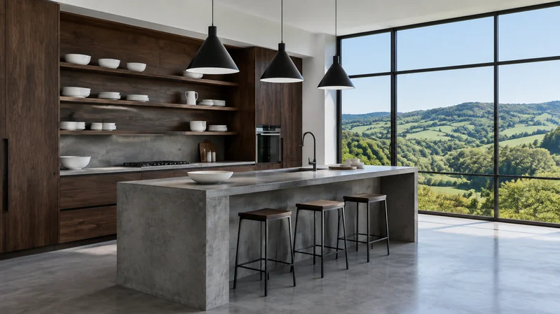
The countryside kitchen in our edit expresses this idea through clarity. Dark walnut cabinetry establishes structure; a simple concrete island provides a central surface; the broad view of the green landscape brings openness. The room feels ready for activity because the composition is not filled with unnecessary objects. Furniture, light and circulation remain easy to understand.
In a compact home, the same principles can be applied on a smaller scale. A narrow dining table might serve meals and occasional work. A bench can provide flexible seating where there is little clearance for chairs. A single closed storage unit can create visual calm more effectively than several scattered containers.
 Style suggestion: Martina ecru fleece-effect armchair with cushion, 106 cm, FSC Mix CreditStyle suggestion: Empuries brown rug · 200 × 300 cm
Select a glowing point to explore a compatible piece.
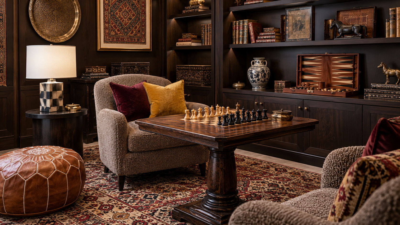
The reading and games nook illustrates the value of giving a corner a purpose. A comfortable seat, a useful table and light in the right place create a destination within a larger room. The setting does not require a complete furniture suite. A thoughtful contrast between warm timber and upholstery gives it personality.
Flexible interiors are also about what we choose to leave out. Clear circulation is a design feature. Space around a chair allows it to be moved. A surface that is not permanently crowded can accommodate more than one activity throughout the week.
The styling edit: Begin with the routines a room must support. Measure the available space, choose furniture around those uses, and let the decorative palette reinforce a layout that already works.
07. Comfort as a Design Principle
The beauty of rooms that feel good to inhabit
Comfort is too often treated as something separate from design, as though a sophisticated interior must sacrifice ease. We see the opposite. The most successful rooms are the ones where visual composition and everyday pleasure support each other: a sofa that invites you to sit, textiles that feel satisfying, and light that works at the times people actually use the room.
This direction is less about a particular style than about the experience of materials. A richly layered room can be restful, while a minimal room can feel welcoming through texture and proportion alone. Softness does not depend on a pile of decorative cushions, and simplicity does not require a room to feel empty.
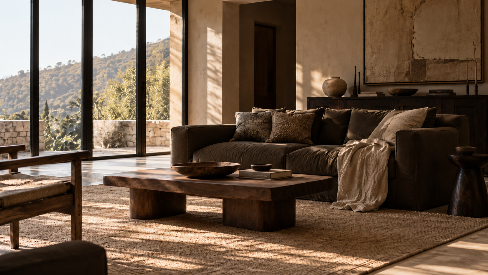 Style suggestion: Veliro four-seat chocolate velvet sofa · 240 cmStyle suggestion: Coffee table · Honey finish
Select a glowing point to explore a compatible piece.
The Wabi-Sabi-inspired living space in our edit uses natural-looking folds and a low table to create an unforced atmosphere. The sofa is substantial, but surrounding surfaces remain quiet. There is room for light to move across the fabrics and reveal their texture. Nothing appears overly arranged, yet every object contributes to the scene.
Comfort also depends on scale. A very deep seat is not right for everyone. A rug must suit the movement of chairs. A bedside lamp should provide light without shining directly into the eyes. These choices are less visible in an editorial image, but they determine whether a room remains enjoyable after the first impression.
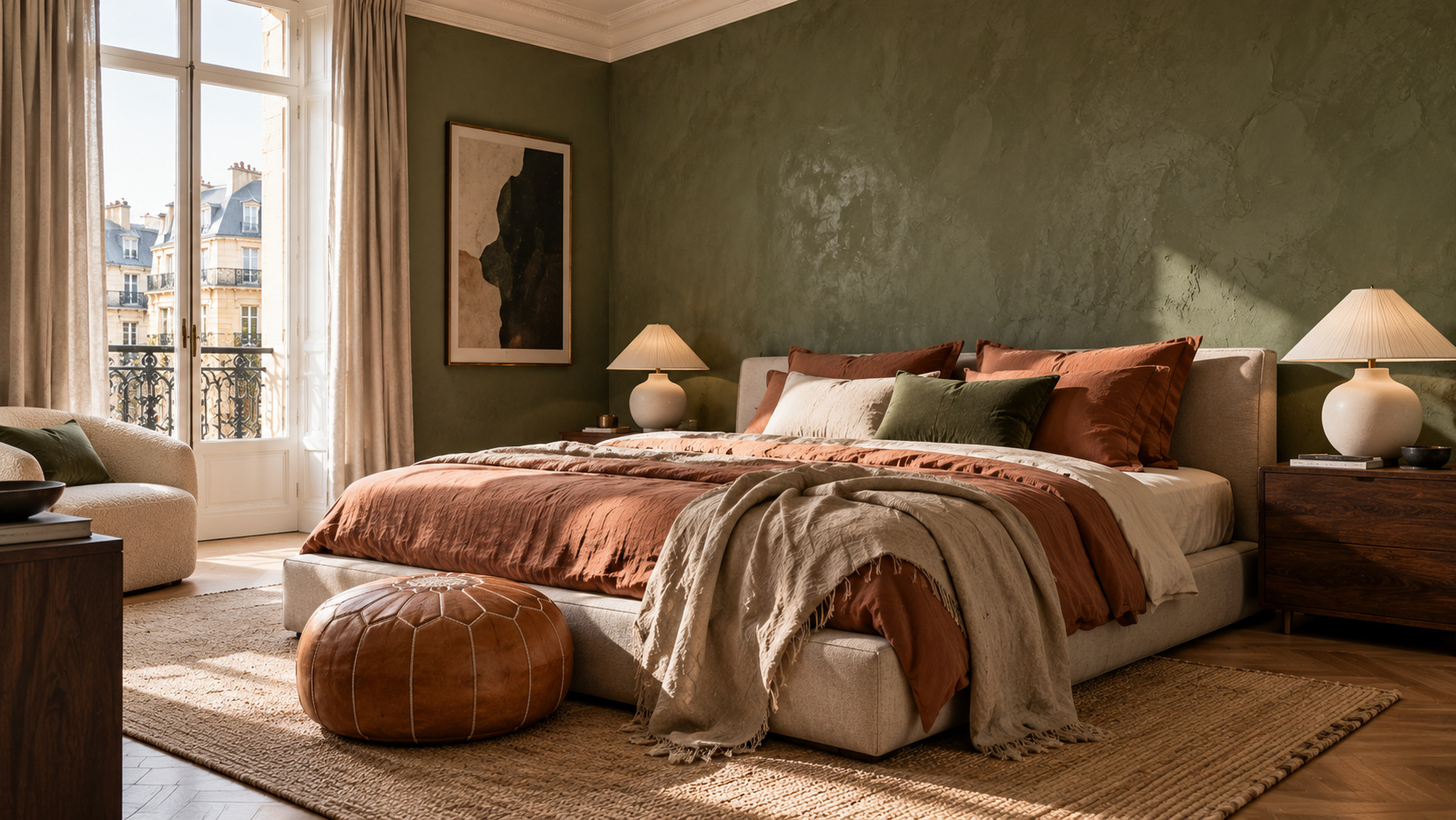 Style suggestion: Martina bed with removable cover · Ecru · 160 × 200 cm mattressStyle suggestion: Shaggy rug · 200 × 300 cm · Off-white
Select a glowing point to explore a compatible piece.
In the bedroom, layered linen and a softer palette create a different kind of ease. One generous coverlet gives the bed weight; a small number of complementary textiles adds depth without making it difficult to use. The room feels calm because the palette and surfaces are working together, not because it has been stripped of personality.
The styling edit: Start with the furniture and textiles used every day. Choose fewer pieces that feel comfortable, practical and visually satisfying, then allow those qualities to shape the atmosphere.
08. Rooms Beyond the Ordinary
A personal point of view is the strongest direction of all
The final direction brings the others together. A room does not need to commit entirely to heritage, minimalism, bold colour or tactile simplicity. It can borrow an element from each, provided the choices form a coherent whole. This freedom is perhaps the most interesting possibility for interiors in 2027.
A neoclassical room may contain contemporary seating. An industrial-influenced kitchen can feel relaxed when connected to a green landscape. A quiet bedroom can make a confident statement through deep colour alone. These interiors have little in common as fixed styles, but they share a clear approach: deciding what deserves attention and what should remain in the background.
The process starts with the room itself. Observe the architecture, the daylight, the dimensions and the furniture that already works. Identify one element worth keeping at the centre. It might be a walnut cabinet, an unusual chair, a textured rug or a distinctive light. Then use colour and supporting pieces to create relationships around it.
This is why we are interested in interiors that feel collected rather than completed in a single purchase. A home gains character through decisions made over time. New pieces can bring contrast, familiar objects can find a different role, and an unexpected combination can become the defining quality of a room.
The point is not to reject trends. They offer new materials, palettes and ways of seeing familiar spaces. Their real value lies in the possibilities they open, not in the pressure to follow them exactly.
The styling edit: Choose one room and make one deliberate change. A different light, a more considered rug, a chair with a stronger silhouette or a new balance of colour may be all it needs.
A final perspective
The interiors we will remember are unlikely to be defined by a single fashionable finish or a perfect matching set. They will be the ones in which material, furniture, light and proportion come together with a sense of purpose. They will make space for comfort and for expression, for old pieces and new ideas, for calm and for surprise.
HOMEOCTOS, SPACES WITH CHARACTER.
Three more pieces
Compatible alternatives selected for their function, shape, colour and texture. See each product sheet for its exact materials and dimensions.